Association for Talent Development
2015–24Designing the service, then building the operation
Research settled who a major revenue line was actually for. Then I built the system that could deliver it.
~80%less manual coordination
I design and build tools that make everyday work effortless.
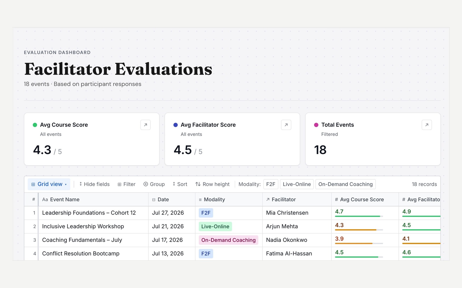
Somewhere in your company there is a spreadsheet with eleven tabs, a colour code, and exactly one person who understands it. I build the thing that replaces it.
Both started with someone asking for a better spreadsheet. Neither problem was the spreadsheet.
Association for Talent Development
2015–24Research settled who a major revenue line was actually for. Then I built the system that could deliver it.
Verizon
2025–26Careful process for customers, scattered files for themselves. I turned the discipline inward, then taught it out.
Pragmatic about tools. Much of my work leverages Airtable because it keeps operations running seamlessly during system transitions. I value transparency over buzzwords — and know precisely when to migrate off no-code infrastructure to custom code.
Both of these were built with AI — Hyperagent for the build, GitHub Copilot alongside it. I direct, it writes the D3 — which is how I find out what a new tool can actually do, and how far an idea travels before it needs an engineer. What I bring is what I bring anywhere: what is worth visualizing, how it should be encoded, and whether the result can be read.
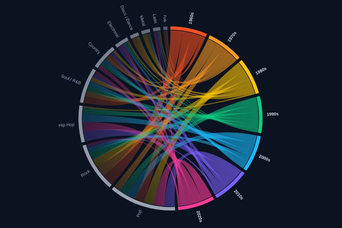
Seven decades, ten genres, 700 songs. Each ribbon connects a decade to a genre; its width is that genre's share of the decade, and read from the other end, that decade's share of the genre.
Hyperagent · Copilot · D3 Open the live version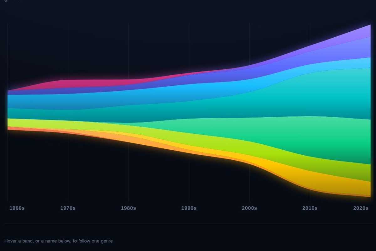
Each band is one genre. Its thickness is that genre's share of the decade scaled by total release volume, so the stack widens as output grows.
Hyperagent · Copilot · D3 Open the live versionNobody hands you a problem. They hand you a solution they’ve already picked out, and it’s almost always a workaround for something sitting one floor down that nobody wants to say into a microphone — usually because saying it means naming a process, or a person, or a decision made in 2019 by someone who has since left for a company with better snacks. Getting down to that floor is most of what I’m actually for.
I came into design sideways, through operations. Five years running the systems before I ever opened Figma, which means I met the spreadsheets as a person who had to keep them breathing, not as someone admiring the tabs. I’ve built somewhere north of fifty product-level apps in Airtable since, and I run a real design process on every one of them — research, framing, iteration, the whole thing. AI has mostly changed the speed of it. I can get to a working version faster, which means I get to throw more of them away, which is the part that was always expensive. But the thinking underneath hasn’t changed.
What operations gave me is the advantage that isn’t technical: I know which cell someone is afraid to click on. I know why the workaround exists, who invented it, and who has been quietly feeding it every Friday afternoon for two years without telling anyone, including their manager.
I’m not an engineer, and I’d rather say so now than have you find out in a code review. I started as an analyst with some SQL and enough data modeling to be useful, wrote Apps Script because the alternative was nobody writing Apps Script, and I now work in an IDE and am still getting fluent with version control. I can build the thing. I can also tell you, out loud and early, when it needs someone with more depth than I have.
The rest of the job is making sure it keeps working after I’ve wandered off. Standards written like an instruction manual, so the next person can follow them without a decoder ring. Identity pulled from a directory instead of typed in by hand, because hand-typed names rot in the dark and you don’t find out until a handoff falls apart at the worst possible moment.

Full-time or contract. Product, platform, internal tools, design systems — anywhere the data model and the interface are the same problem, and someone has to do both.
Remote, based in Washington, DC. Internal or customer-facing.
Research settled who the company's second-largest revenue stream was actually for. I then designed and built the system that delivered it — an 80% drop in manual coordination, and forecasting on live data.
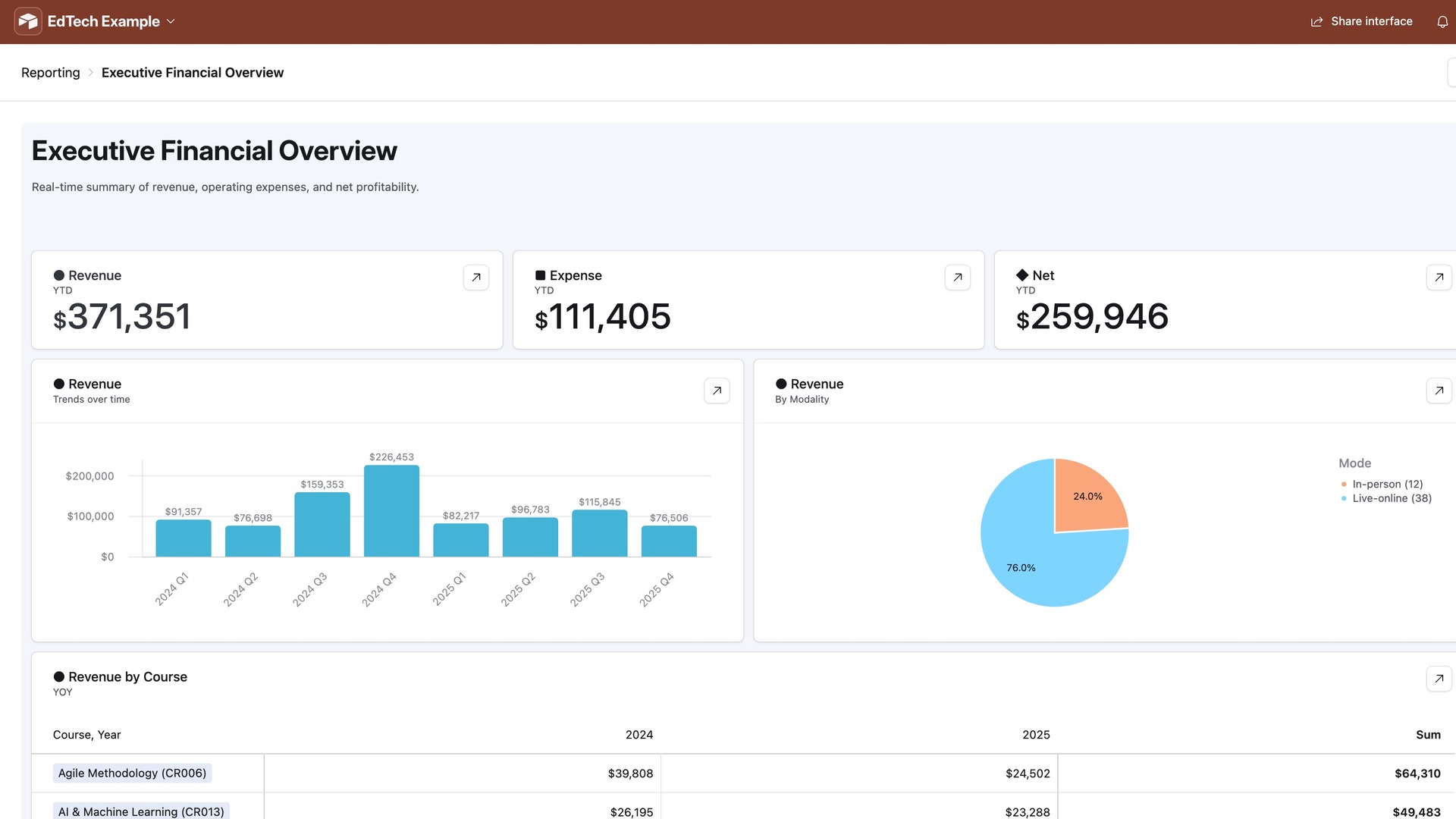
I owned this end to end: the research questions, the jobs-to-be-done synthesis, the data model, and every interface in the system. I commissioned a firm for the focus groups and partnered with our solutions engineer on integrations and our data scientist on metrics.
Product decisions were being made on instinct — every team held its own mental model of the customer. I paired qualitative research with analytics, synthesized through jobs-to-be-done, and got three distinct archetypes.
"When I'm responsible for training but was never taught how, I want the fundamentals in a structured order."
"When I'm given responsibilities I've never had, I want guidance from someone who's actually done it."
"When I've mastered my current practice, I want exposure to ideas outside my routine."
They became the planning language. Each implied a different delivery format, which gave us a demand signal to forecast and staff against instead of planning to last year's numbers.
Those three formats are structurally incompatible: sequenced curriculum, one-to-one coaching, open exploration. Knowing that was only valuable if we could deliver it — and the operation still ran on spreadsheets.
Over 30 courses ran across in-person, live online and on-demand, each modality in its own file with its own cost structure. Coordinators rekeyed the same session into three places. Leaders waited a week for answers that did not reconcile with what was scheduled.
Finance rebuilt the budget by hand each month, knowing it would be wrong by Friday.
The state of play, 2020The core design challenge was restraint. A system this broad invites you to put everything on every page. Instead: three layers — a catalog of what we offer, an operational layer for what is actually running, and a decision layer where sales data met scheduled offerings.
The operational layer is where the real information architecture sat. In-person sessions bind to a venue and travel costs; live online has capacity limits and no location; on-demand has no date logic at all. Forcing all three into one session table produces a form that is half empty whichever one you are creating — so each modality got its own surface, sharing the same course reference and cost structure underneath.
I designed the data model — the entity relationships underneath courses, sessions, instructors, locations and enrollments, including the many-to-many structures that let one course exist across three modalities without duplication — wrote the formulas and scripts driving scheduling logic, cost rollups and automated notifications, and built every interface in the system.
Facilitators asked to see their own evaluation results. A daily CSV landed automatically, rolled up into per-question averages and an overall score, with row-level filtering so each facilitator saw only their own — no cross-comparison, no leaderboard.
// nightly: fold the evaluation CSV into per-question averages,
// then one overall score per facilitator-session.
const rows = await intake.selectRecordsAsync({ fields: FIELDS });

const bySession = groupBy(rows.records, r => r.getCellValue('Session')[0].id);

for (const [sessionId, responses] of bySession) {
  const perQuestion = QUESTIONS.map(q => ({
    question: q,
    mean: avg(responses.map(r => r.getCellValue(q))),
    n: responses.length,
  }));

  await scores.updateRecordAsync(sessionId, {
    'Per question': JSON.stringify(perQuestion),
    'Overall': round(avg(perQuestion.map(p => p.mean)), 1),
    'Responses': responses.length,
  });
}
Every view was designed backward from one person's question, not forward from the data available. That's why coordinators, instructors and leaders see almost no fields in common.
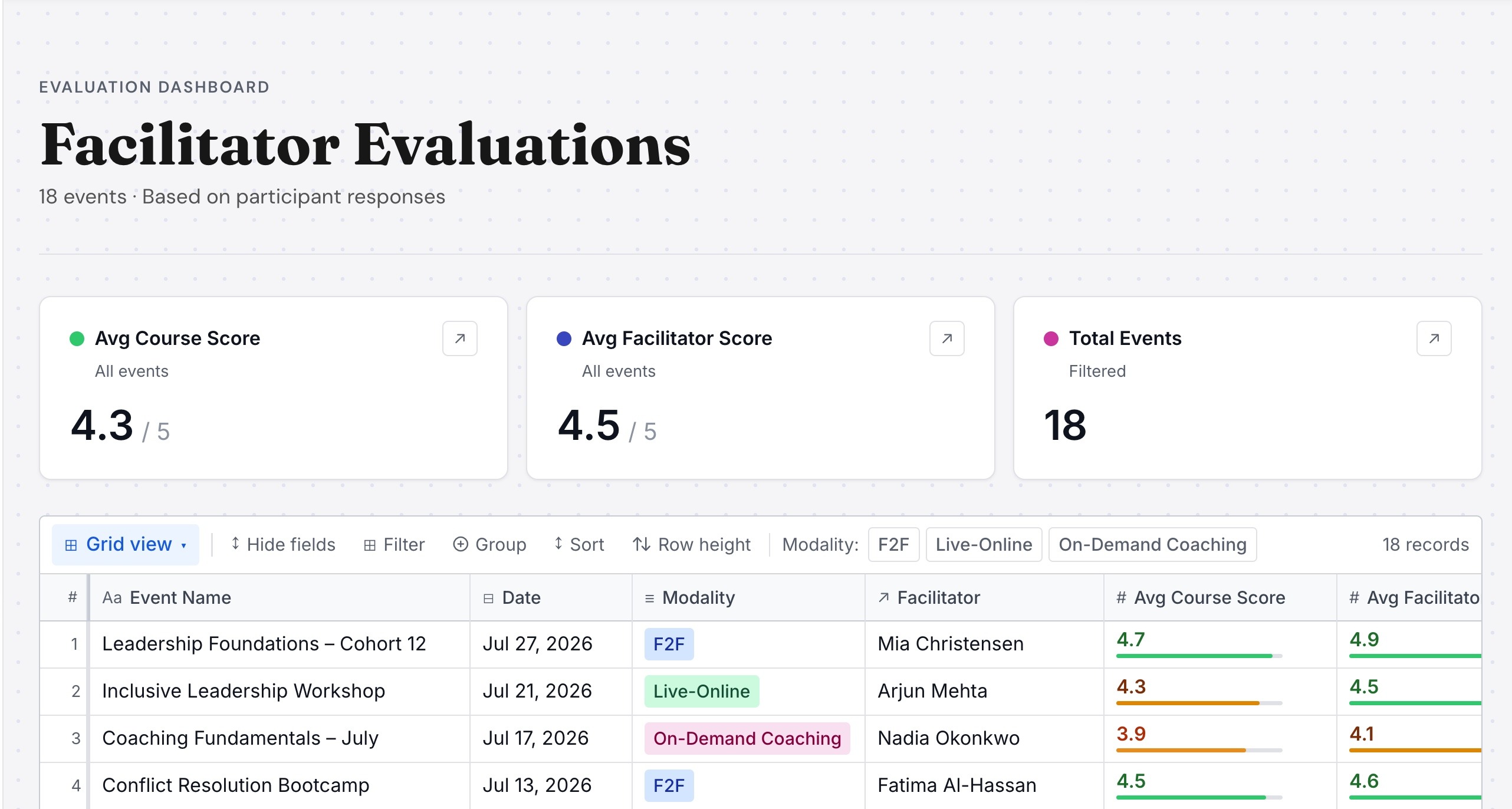
Because the work finally happened in one place, financial data attached directly to the activity record. Budget stopped being a separate estimate and became a rollup of what was actually happening — and when a forecast arrived early enough, it changed what we scheduled.
The archetypes reached planning faster than they reached everyone else. Forecasting and capacity adopted them as working language, while marketing, sales and education each held onto their own picture of the customer for longer. Adopting a shared model is a change-management problem, not a research problem. I would now build the rollout alongside the research rather than after it.
Adoption was harder than the build. People did not want to give up their spreadsheets, and arguing in the abstract went nowhere. What worked was narrowing to one use case, proving it, and letting the result recruit the next team. I got there by trial and error; I would plan that sequence of proof points from the start.
An 800-person organization ran rigorous process for its customers and spreadsheets for itself. I owned the internal tools platform: the standards, the practice around it, and roughly twenty things built on top.
I was product owner for the internal tools platform, embedded in an 800-person organization and partnering with the design systems team to extend their patterns into the tools people used every day. I ran discovery, designed and built the systems, wrote the standards, and taught them.
Senior leaders needed visibility into user defect tickets across the organization. The data existed — Jira, spreadsheets, team-owned files — but nowhere that could answer the actual question: where are we at risk?
I merged those sources into one Airtable base — transformation, migration and cleanup to make records from different systems reconcile — then modelled ownership so defects resolved by team and sub-team, which is how leaders think about accountability.
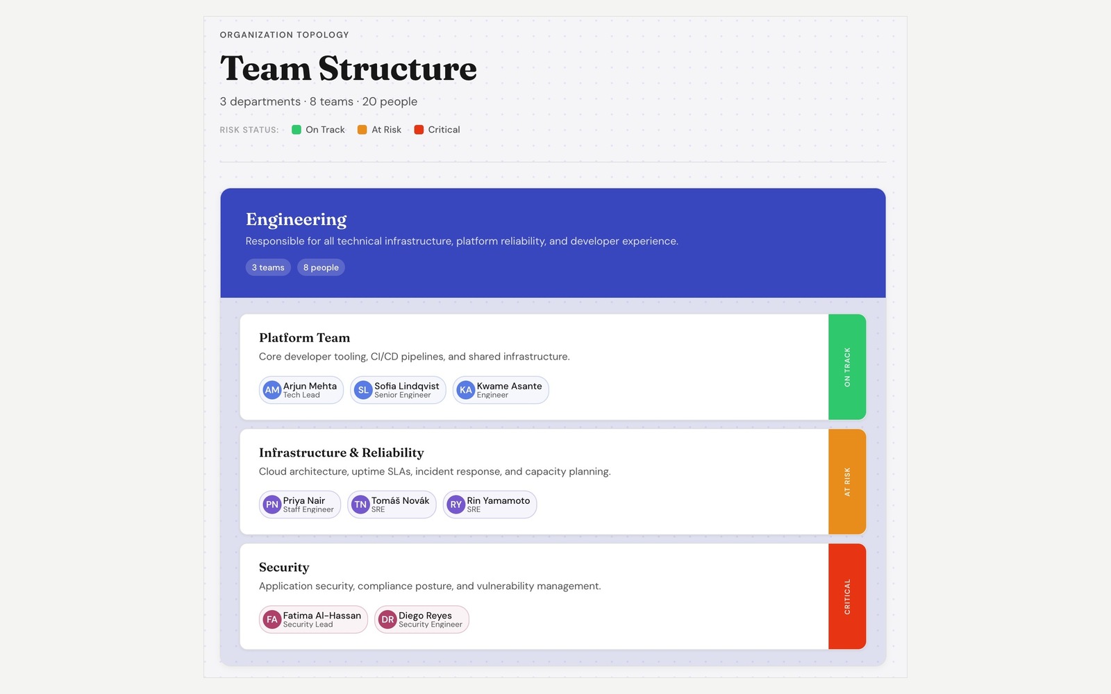
A colleague had wireframed a concept. I took it through three passes: a Figma Make prototype to settle the interaction, then GitHub Copilot to rebuild it against real Verizon Design System components, then the Airtable SDK to run it on live data. The result was a custom extension, rendered in D3, with a revised interface: departments, their teams and the people in them, with risk carried on the edge of every card so structure and trouble were legible at a glance rather than read out of a table. The next question was already visible — if an area is at risk, do we have the people to cover it? — so I modelled it to take staffing data and answer that too.
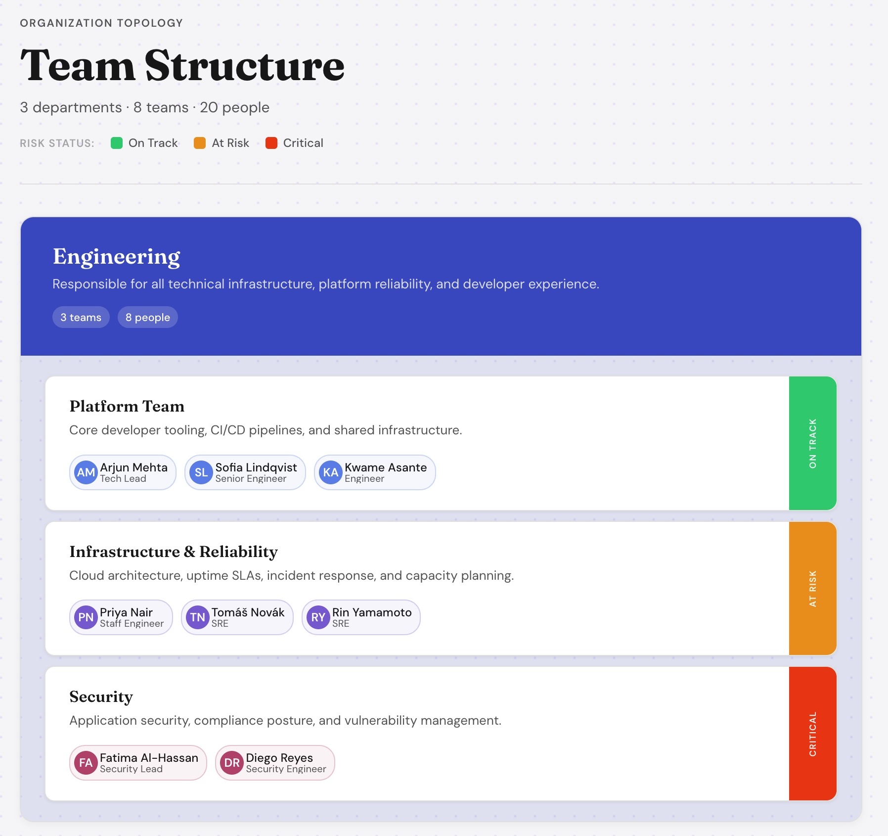
The real problem was that stakeholder names were typed by hand, and hand-typed names rot. Someone moves teams and the record still points at them. Nobody notices until a handoff fails.
I connected the Google Directory API so identity came from the source of truth and stayed current as people moved.
Unglamorous, and exactly the kind of decision that determines whether a system is still trustworthy a year after you've left it.
The platform did not need enforcing. It needed teaching.
How the practice actually grewPeople wanted to build things and did not know how to build them well. Governance, in practice, meant making it easy to learn rather than hard to break things.
I wrote the standards playbook — naming conventions, field standards, permissions, component lifecycle — as an instruction manual rather than a rulebook, and put four ways to get help around it.
I also built and shipped around ten separate bases while I was there — each its own small product, with its own users, data model and permissions. More than ten of the other things I shipped were custom extensions against the Airtable and Figma SDKs, the team topology above among them, each a request from a team whose problem the stock interface could not solve. They have nothing in common with one another, which is the point: the platform could absorb whatever a team actually needed, instead of sending them back to a spreadsheet.
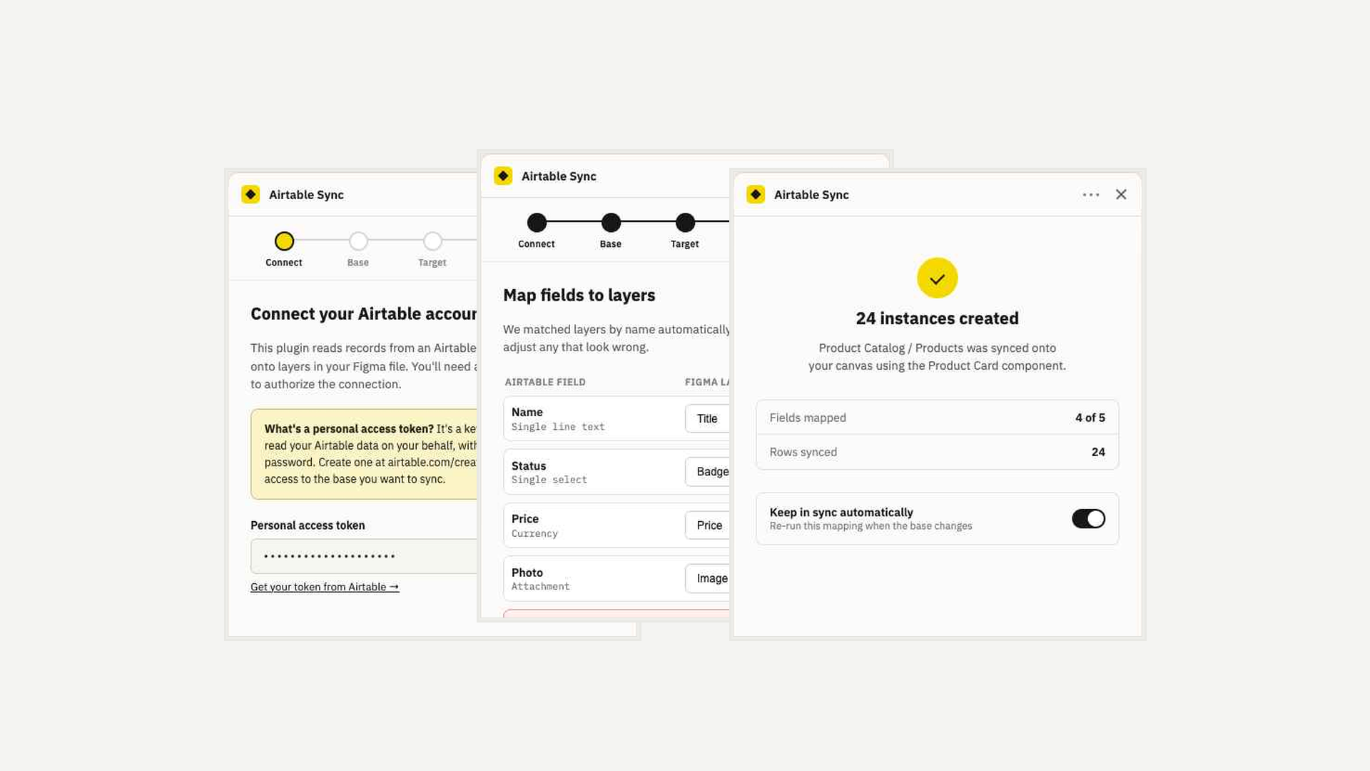
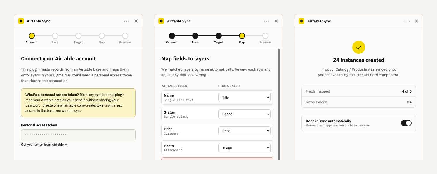
One example: a working Figma plugin that piped live product-card data into design tiles, so designers worked from source-of-truth content instead of hand-copying it into mockups. I authored it against the Figma Plugin API using GitHub Copilot. It worked, and then the work was reprioritized before it went further.
The design problem was not the sync — it was that the people using it did not think in Airtable schemas. So the flow is five plainly-named steps with a persistent stepper, each screen explaining its own vocabulary, ending in a state that tells you exactly what happened and offers to keep doing it.
// map an Airtable field onto a named layer in the selected component
async function applyRow(component, row, mapping) {
  const instance = component.createInstance();

  for (const [field, layerName] of Object.entries(mapping)) {
    const node = instance.findOne(n => n.name === layerName);
    if (!node) continue;                      // layer renamed — skip, warn later

    if (node.type === 'TEXT') {
      await figma.loadFontAsync(node.fontName);
      node.characters = String(row[field] ?? '');
    } else if (node.type === 'RECTANGLE' && row[field]?.url) {
      node.fills = [{ type: 'IMAGE', scaleMode: 'FILL',
                      imageHash: await hashFrom(row[field].url) }];
    }
  }
  return instance;
}
I used Copilot and Claude to prototype and test workflows before engineering was engaged. The cheapest moment to discover a workflow is wrong is before anyone has scheduled a sprint for it.
On the AI enablement team I shipped the organization's AI tool registry as a Google Apps Script web app — open to anyone with Workspace access, no license required — and stood up the intake process for GitHub Copilot.